
Symptom Check Plus
SymptomCheck+ is a personalized health app designed to help college students manage minor illnesses with calm, trustworthy, and actionable symptom guidance. Unlike traditional symptom-checking tools, which often lead to anxiety-inducing results, SymptomCheck+ prioritizes clarity, personalization, and stress-free diagnosis suggestions.
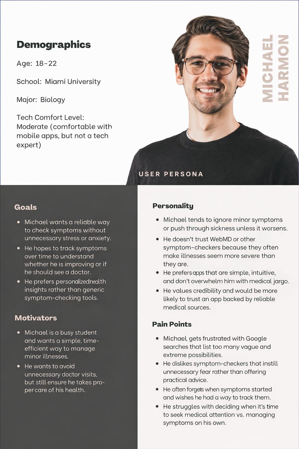
Research Approach
Preliminary Interviews
Conducted five in-depth interviews with college students to uncover key concerns and challenges related to symptom-checking, health management, and their experiences using existing digital tools.
User Research
Developed a structured interview protocol based on initial findings, then conducted five 20-45 minute interviews to gain deeper insights into user behaviors, frustrations, and expectations for a better health management solution.
Pattern Analysis & Key Insights
Identified common themes and overlapping concerns by organizing user feedback into an affinity diagram, highlighting the most pressing issues students face when managing their health.
Competitive Analysis
Researched and tested direct and indirect competitors, including WebMD, MyChart, Google, and non-consumption behaviors. This analysis provided valuable insights into what works, what doesn’t, and how SymptomCheck+ can differentiate itself within the market.
Next Steps & Iteration
Moving forward, sketches, wireframes, and prototypes will be developed and tested through sitemaps, A/B testing, and multiple design iterations to ensure optimal usability, accessibility, and effectiveness for college student
Reduce User Anxiety
Current tools list too many possibilities, making minor illnesses seem severe.
Solution: Provide a refined list of the most probable conditions based on context (age, activity level, medical history, etc.)
“So many similar symptoms of sicknesses that you can’t really tell unless you get tested.” -Participant 1
Integrate Symptom Tracking & Progress
Users want to track symptom progression to determine whether their condition is improving or worsening.
Solution: Allow users to log symptoms over time, compare with past records, and see when medical attention is necessary.
Personalized Advice & Next Steps
Users often don’t know what to do next after checking symptoms.
Solution: Provide recommended at-home treatments, recovery timelines, and alerts for when to see a doctor.
User-friendly, Safe Language
Many students feel that online health searches cause unnecessary panic.
Solution: Use supportive, clear language that reassures users rather than alarming them.
“Not tell me I’m going to die” -Participant 2
Campus Health Integration
Some students expressed interest in quick access to student health services if symptoms persist.
Solution: Integrate with university health services, allowing students to book appointments or receive medical recommendations directly through the app.
Key Insights & Next Steps
Design Tenets
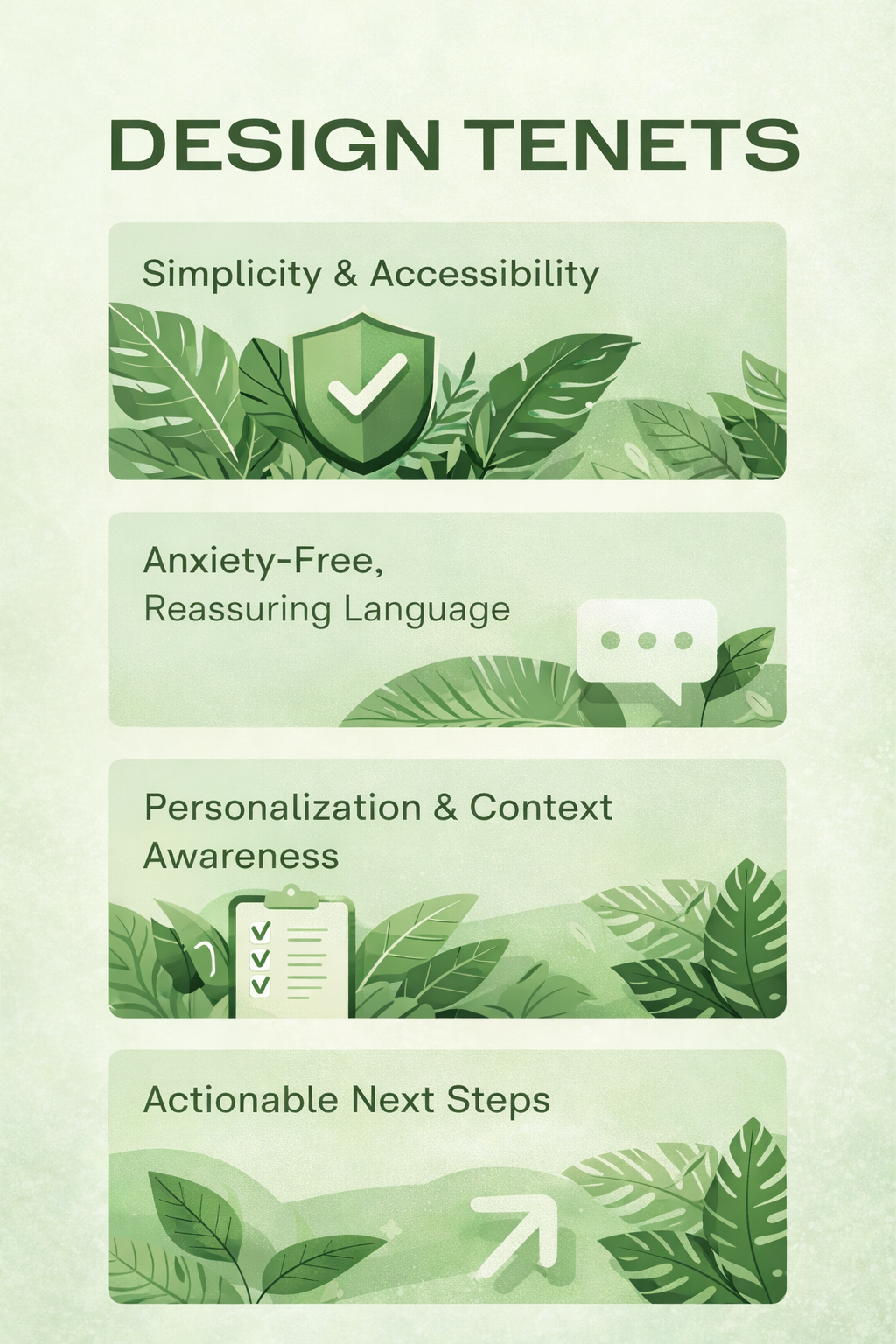
SymptomCheck+ is designed around four key principles that prioritize clarity, trust, and user confidence. The app emphasizes simplicity and accessibility by presenting health information in an intuitive, easy-to-understand format without overwhelming users with medical jargon. It also focuses on personalization, allowing users to track symptoms over time and receive insights based on their health history. To reduce unnecessary stress, the app uses calm, reassuring language that avoids worst-case scenarios and instead frames advice in a supportive way. Finally, SC+ provides actionable next steps, offering practical self-care guidance and recommendations for when medical attention may be helpful so users feel informed and empowered.
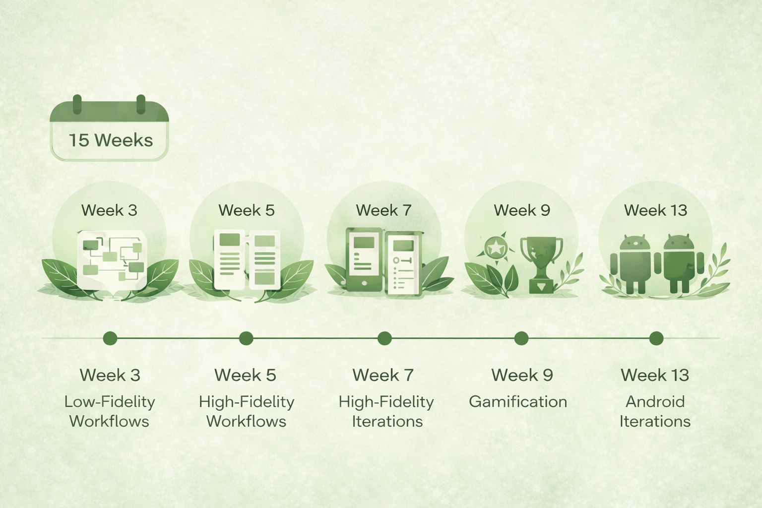
Over 15 weeks, the project progressed from low-fidelity workflow exploration to high-fidelity prototypes, iterative testing, and feature development.
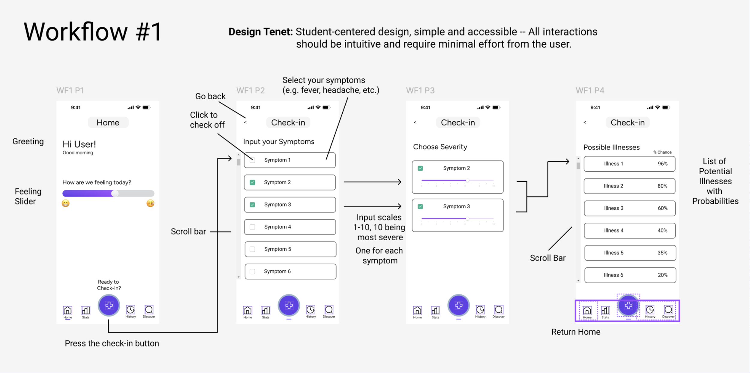
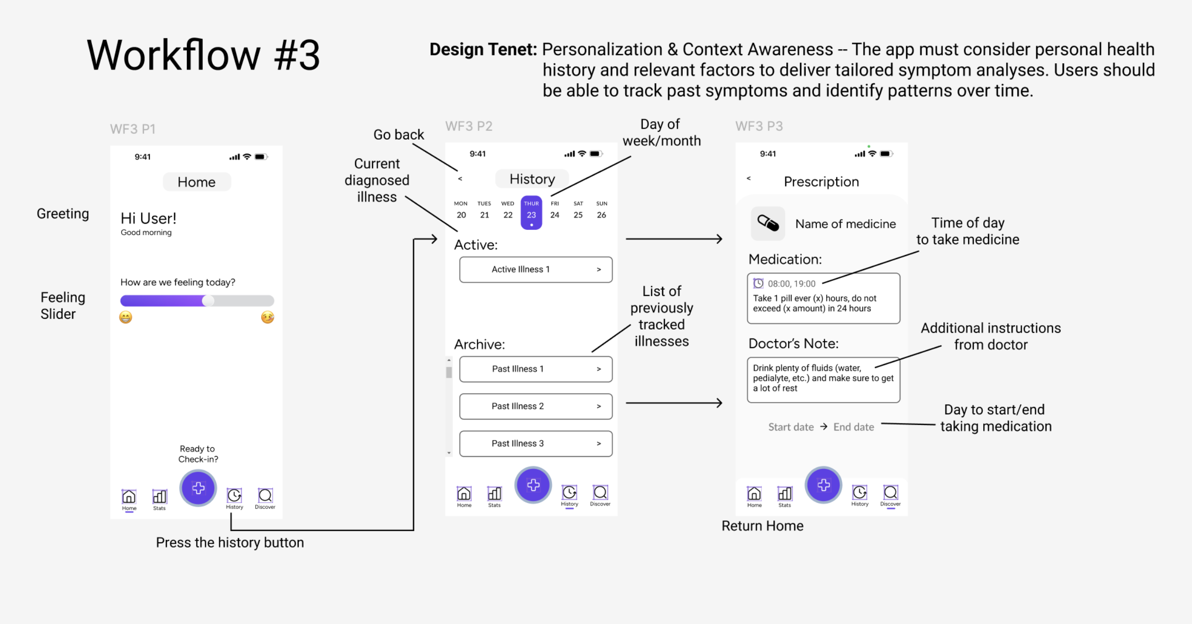
These low-fidelity workflows map the core user journeys within SymptomCheck+, helping visualize how users move through symptom check-ins, illness discovery, health tracking, and progress insights before moving into high-fidelity prototypes.
Low Fidelity Workflows
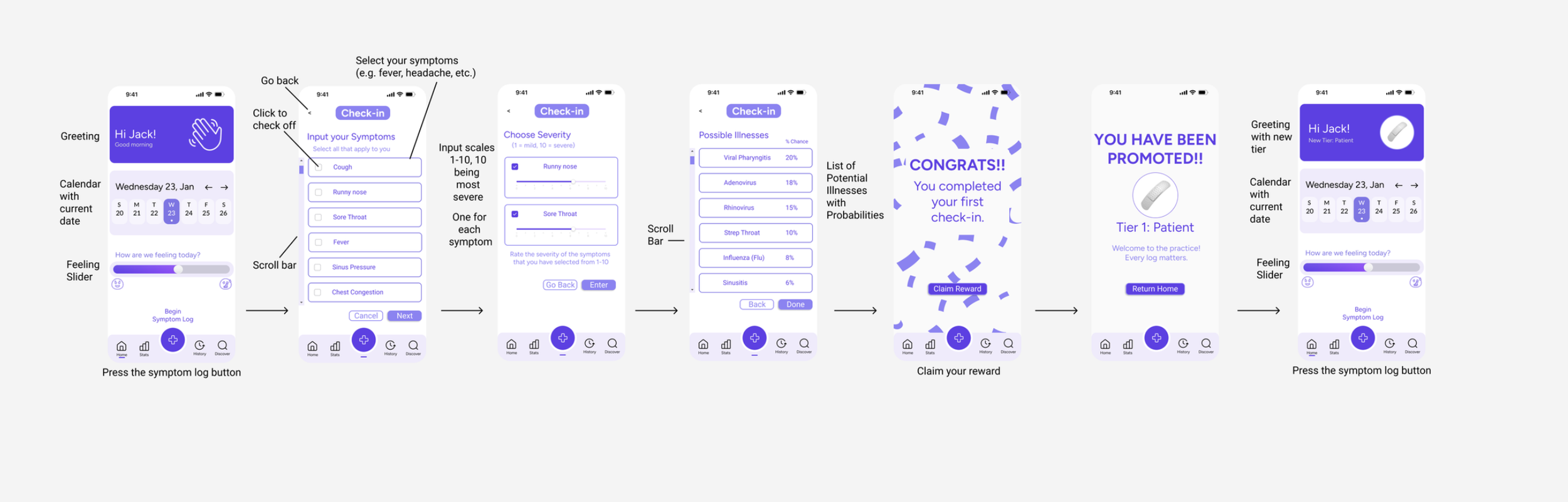
High Fidelity Workflows
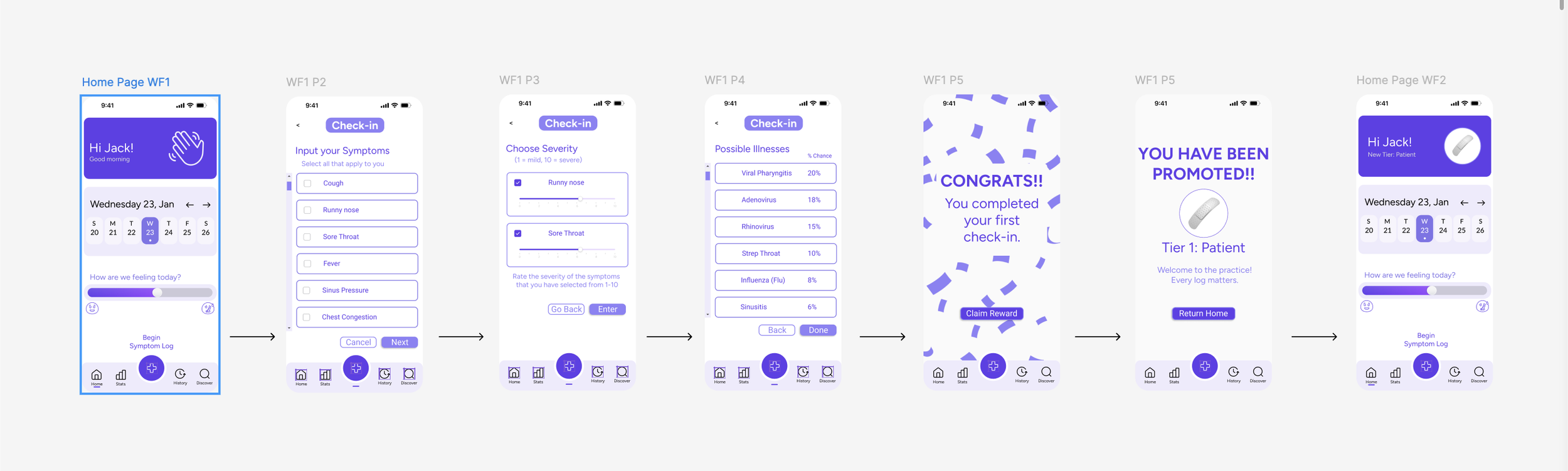
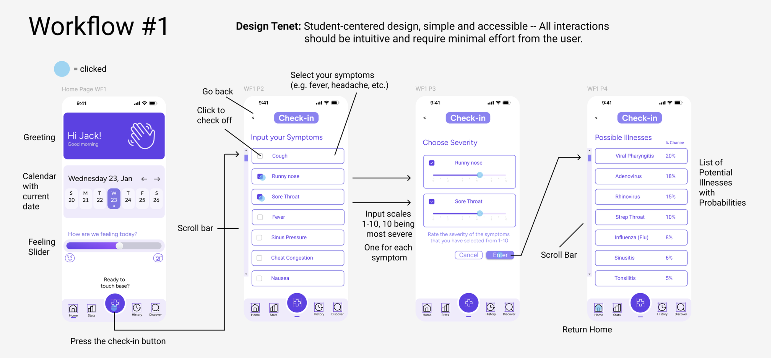
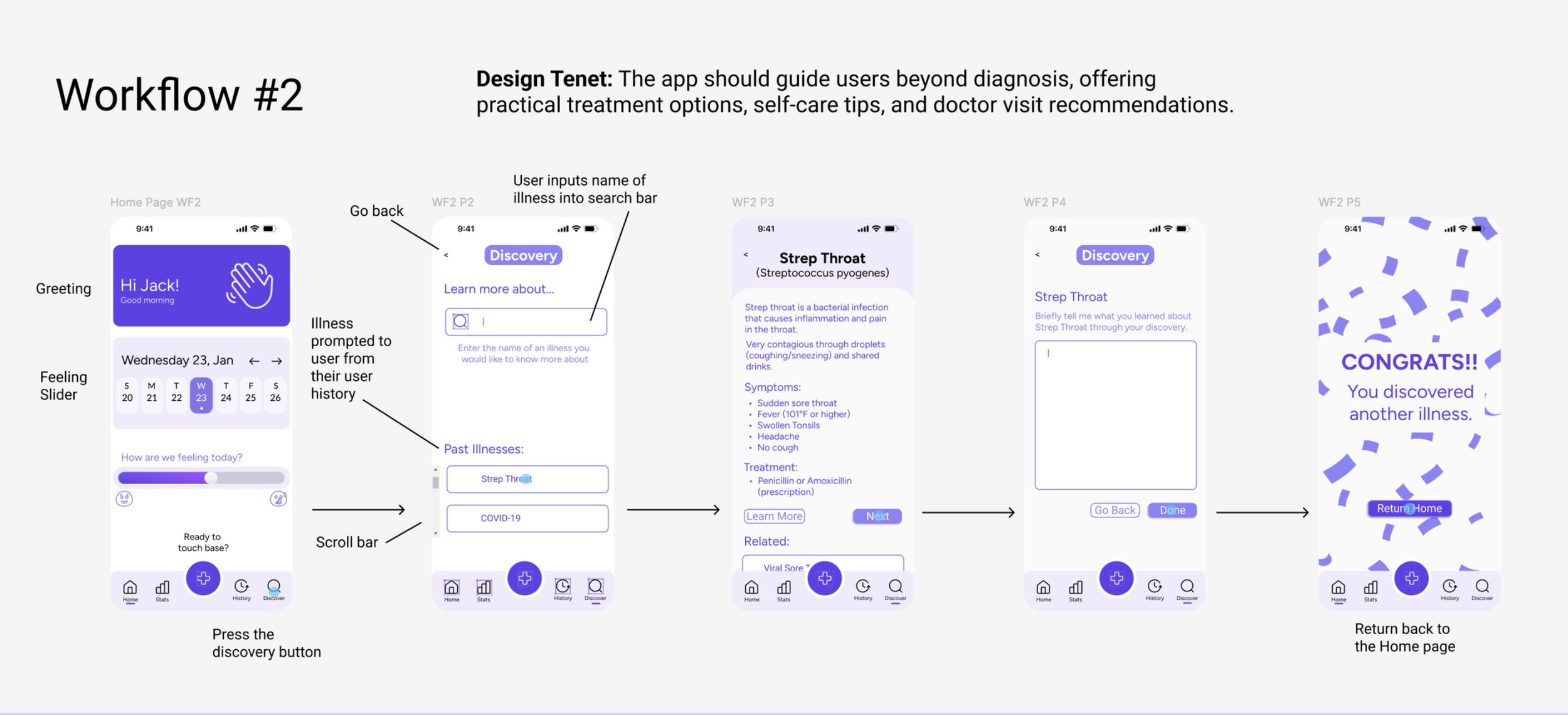
These high-fidelity workflows refine the initial concepts into polished interface flows that demonstrate how users interact with SymptomCheck+ to check symptoms, explore possible conditions, track their health history, and monitor progress over time.
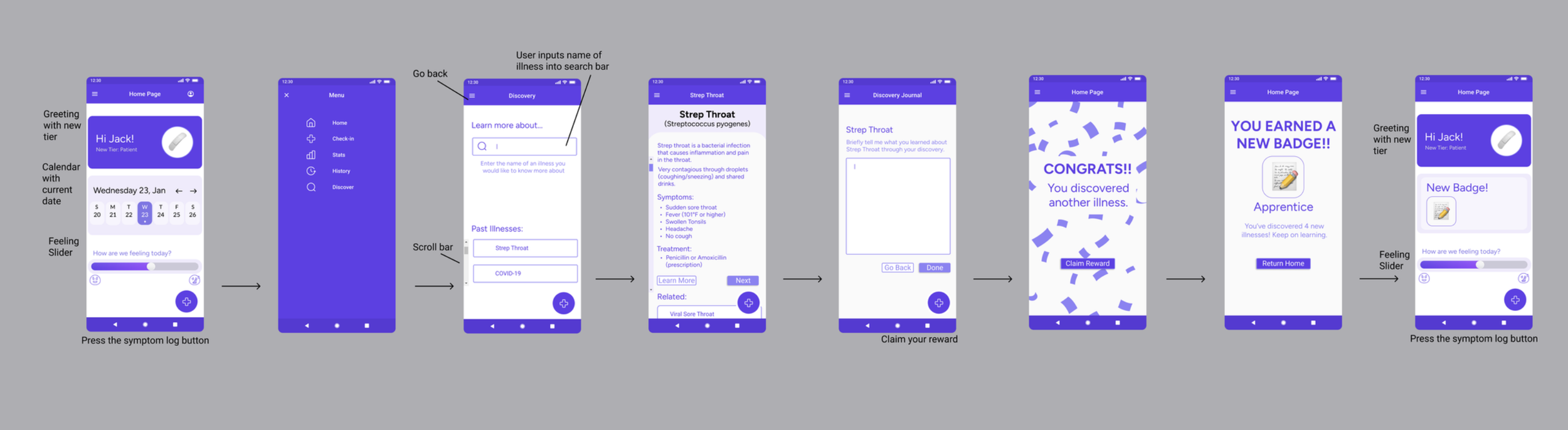
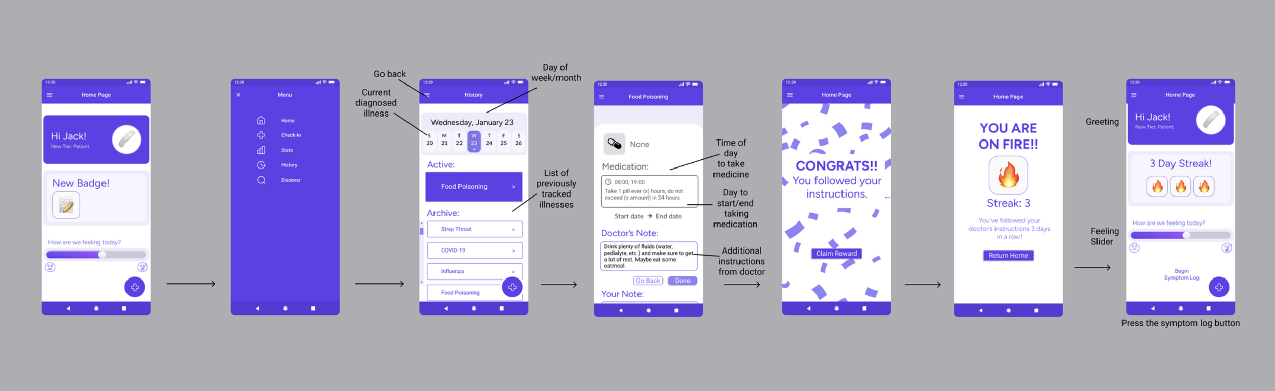
Gamification elements were introduced to encourage engagement and reinforce positive health behaviors throughout the SymptomCheck+ experience. After completing key actions such as symptom check-ins, illness discovery, or following prescription instructions, users now receive celebratory feedback, tier promotions, badges, and streak rewards that highlight their progress. Features like tier upgrades, milestone badges for discovering illnesses, and streak tracking for following health instructions create a sense of achievement while motivating users to continue using the app. By incorporating familiar reward mechanics similar to fitness and learning apps, these updates transform routine health management tasks into a more engaging and habit-forming experience.
Gamification Integration
Android Iterations
To adapt SymptomCheck+ for Android, several updates were made to align the design with Material Design standards and common Android interaction patterns. The iOS-style bottom navigation bar was replaced with a hamburger menu, providing a more familiar navigation structure for Android users and allowing access to key sections such as Home, Check-In, Stats, History, and Discover. A floating action button (FAB) was also introduced for starting the symptom log. Positioned in the bottom right corner with a “+” icon, the FAB highlights the app’s primary action while keeping the interface clean and uncluttered. Visual adjustments were also made to match Android’s design language, including switching all typography to Roboto and reducing corner radii from 10px to 4px for a more structured look. Additional refinements such as flatter buttons and simplified interface elements help create a cohesive Android-native experience.
Reflection & Takeaways
*
Reflection & Takeaways *
Developing SymptomCheck+ helped me better understand how thoughtful design can reduce anxiety and support better health decision-making. Early user interviews revealed that many existing symptom-checking tools overwhelm users with worst-case scenarios and unclear guidance. These insights shaped the project’s focus on calm communication, personalization, and clear next steps. By starting with low-fidelity workflows and iterating into high-fidelity prototypes, I was able to test core user journeys such as symptom check-ins, illness discovery, and health tracking before refining the final interface.
User feedback played a major role in improving the experience throughout the project. Small changes such as clearer instructions, visible scrolling cues, and supportive progress messages significantly improved usability. Later iterations also introduced gamification elements, including tiers, badges, and streaks, to encourage consistent engagement and reinforce healthy habits. These additions helped transform symptom tracking from a simple tool into a more motivating and supportive experience.
Overall, this project strengthened my understanding of user-centered design and iterative product development. Moving from research and personas to workflows, design systems, and platform-specific adaptations reinforced the importance of grounding design decisions in real user needs while also considering platform conventions such as Android’s Material Design.

Notable Skills & Tools
Conducted semi-structured interviews with college students to identify frustrations with existing symptom-checking tools and synthesize insights that informed design decisions.
User Research
Developed user personas and design tenets to guide the product toward clarity, personalization, and anxiety-reducing interactions.
User Personas
& UX Strategy
Designed low-fidelity workflows to map key user journeys including symptom check-ins, illness discovery, health tracking, and progress insights.
Wireframing & Interaction Design
Created detailed UI workflows and interactive prototypes in Figma to visualize the full product experience and refine interface elements.
High-Fidelity Prototyping (Figma)
Applied feedback from testing to refine navigation, improve interaction clarity, and address usability issues across multiple workflow iterations.
Iterative Design & Usability Improvements
Introduced reward systems such as tiers, badges, and streaks to motivate continued engagement and reinforce healthy behavior.
Gamification Design
Adapted the interface from iOS conventions to Android Material Design patterns, including navigation structure, typography, and floating action buttons.
Cross-Platform UX Design
Structured features such as symptom logs, health history, discovery tools, and analytics into a clear and intuitive navigation system.